Code
pacman::p_load(tidyverse,haven,dplyr,tidyr,ggplot2,plotly,patchwork,ggthemes,gganimate,readr,ggridges,ggdist)According to an office report as shown in the infographic below, there are some insights about climate change in Singapore.
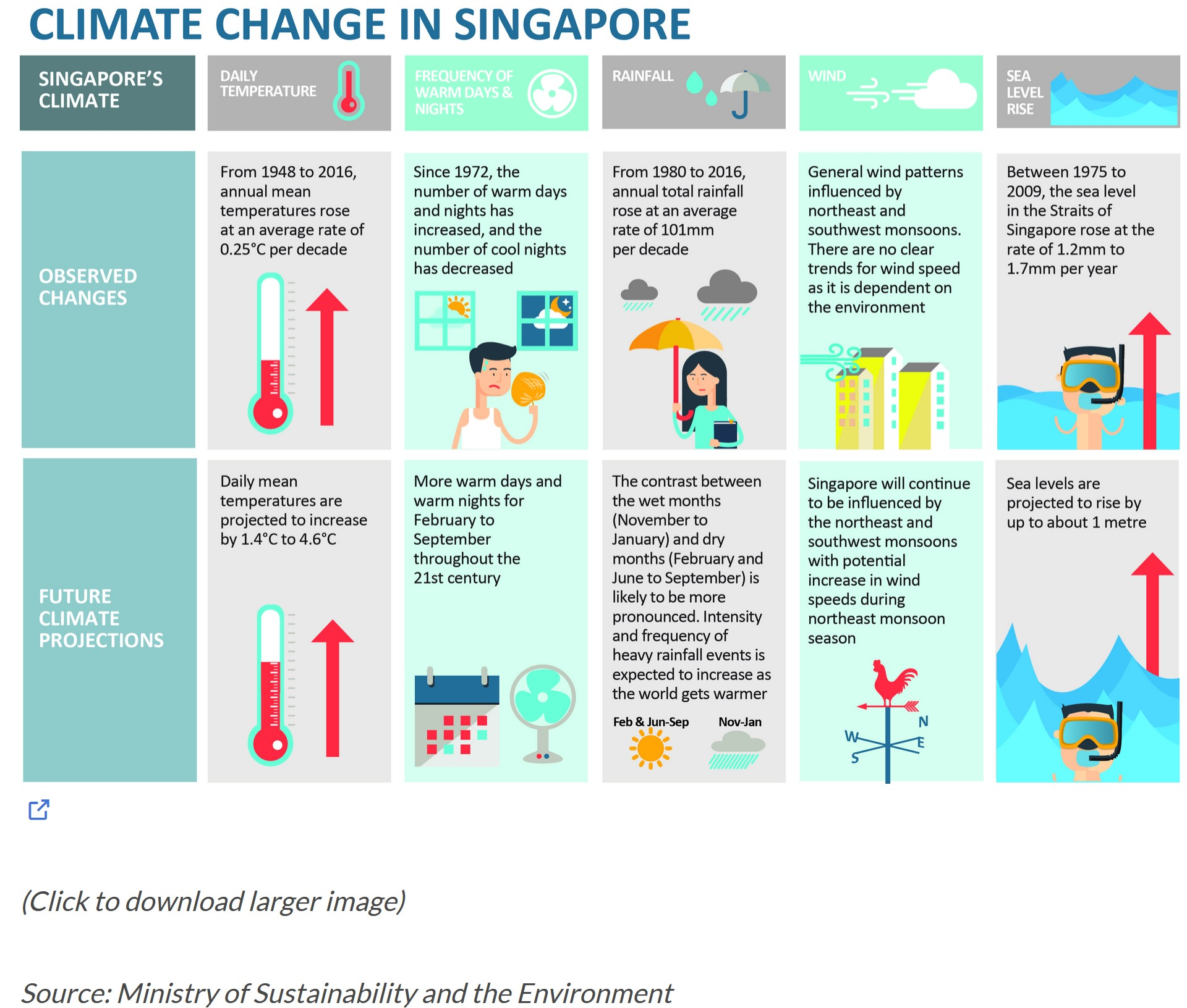
As for the rainfall insights above, I will apply appropriate interactive techniques to enhance the user experience in data discovery and visual story-telling to see the contrast between the wet months (November to January) and dry months (February and June to September) .
pacman::p_load(tidyverse,haven,dplyr,tidyr,ggplot2,plotly,patchwork,ggthemes,gganimate,readr,ggridges,ggdist)The data set is downloaded from Meteorological Service Singapore website. I chose rainfall records of Changi station for August (dry month) and December (wet month) of the years 1983, 1993, 2003, 2013, and 2023 to see the distribution and trends.
As we just focused on the rainfall distribution, so i only chose four columns: Year, Month, Day, and Daily Rainfall Total (mm).
# List of file paths
Aug_paths <- c("data/DAILYDATA_S24_198308.csv", "data/DAILYDATA_S24_199308.csv",
                "data/DAILYDATA_S24_200308.csv", "data/DAILYDATA_S24_201308.csv",
                "data/DAILYDATA_S24_202308.csv")

# Read and combine all files into one data frame
combined_Aug <- Aug_paths %>%
  lapply(read_csv, locale = locale(encoding = "latin1")) %>%
  bind_rows() %>%
  select(Year, Month, Day, `Daily Rainfall Total (mm)`)

combined_Aug <- combined_Aug %>%
  mutate(Month = "August")

# Display the combined dataset
head(combined_Aug)
# A tibble: 6 × 4
Year Month Day `Daily Rainfall Total (mm)`
<dbl> <chr> <dbl> <dbl>
1 1983 August 1 0
2 1983 August 2 6.4
3 1983 August 3 2.8
4 1983 August 4 3.7
5 1983 August 5 18.7
6 1983 August 6 0 # December data
Dec_paths <- c("data/DAILYDATA_S24_198312.csv", "data/DAILYDATA_S24_199312.csv",
"data/DAILYDATA_S24_200312.csv", "data/DAILYDATA_S24_201312.csv",
"data/DAILYDATA_S24_202312.csv")
# Read and combine all files into one data frame
combined_Dec <- Dec_paths %>%
lapply(read_csv, locale = locale(encoding = "latin1")) %>%
bind_rows() %>%
select(Year, Month, Day, `Daily Rainfall Total (mm)`)
combined_Dec <- combined_Dec %>%
mutate(Month = "December")
# Display the combined dataset
head(combined_Dec)# A tibble: 6 × 4
Year Month Day `Daily Rainfall Total (mm)`
<dbl> <chr> <dbl> <dbl>
1 1983 December 1 2.8
2 1983 December 2 1.7
3 1983 December 3 5
4 1983 December 4 8.2
5 1983 December 5 0
6 1983 December 6 0 As we need to compare if there is any difference between August and December, we could use the mean value of each year for different months to see if there is any difference. We can also compare the distribution in large rainfall values to see if there is any chance that certain month has much more proportion. Thus, I chose to use a jitter plot to see the data.
combined_data <- rbind(combined_Aug, combined_Dec)

# Calculate the mean rainfall for each year and month
mean_rainfall <- combined_data %>%
  group_by(Year, Month) %>%
  summarize(Mean = mean(`Daily Rainfall Total (mm)`, na.rm = TRUE)) %>%
  ungroup()

# Create a ggplot object with jitter, mean points and lines for each month
ggplot_object <- ggplot(combined_data, aes(x = as.factor(Year), y = `Daily Rainfall Total (mm)`)) +
  geom_jitter(aes(color = Month), width = 0.2, height = 0, size = 2,alpha = 0.6) +
  geom_point(data = mean_rainfall, aes(y = Mean, color = Month), size = 3, shape = 18) +
  geom_line(data = mean_rainfall, aes(y = Mean, color = Month, group = Month), size = 0.3, linetype = "dotted") +
  scale_color_manual(values = c("August" = "red", "December" = "blue")) +
  labs(title = "Changi: Daily Rainfall (1983-2023)",
       x = "Year",
       y = "Daily Rainfall Total (mm)",
       color = "Month") +
  theme_minimal() +
  theme(legend.position = "bottom")

# Adjusting y-axis to increment by 25
ggplot_object <- ggplot_object +
  scale_y_continuous(breaks = seq(0, max(combined_data$`Daily Rainfall Total (mm)`), by = 25))

# Convert the ggplot object to a plotly object for interactivity
plotly_object <- ggplotly(ggplot_object)

# Display the plot
plotly_objectFrom the scatter plot, two primary insights can be drawn regarding rainfall patterns for August and December. First, the mean rainfall in December appears to be higher than in August, indicated by the average position of December’s data points being higher on the y-axis. Second, when observing rainfall events exceeding 25mm, the majority are represented by December’s data points, suggesting that heavy rainfall is more prevalent in December than in August. Overall, the data suggests that December experiences a greater quantity of rainfall compared to August.
We also noticed that most of the value is distributed around 0, which is slightly ambiguous. We can calculate the number of rain days to see the difference between dry and wet months.
We can derive the number of rainy day to see if the discrepancy is larger by year.
# Calculate the number of rainy days per year for each month
Rainfall_Days <- combined_data %>%
  group_by(Year, Month) %>%
  summarize(Rainy_Days = sum(`Daily Rainfall Total (mm)` > 0, na.rm = TRUE)) %>%
  ungroup()

# Create a ggplot object with lines and points for each month
ggplot_object <- ggplot(Rainfall_Days, aes(x = Year, y = Rainy_Days, group = Month, color = Month)) +
  geom_line() +
  geom_point() +
  scale_color_manual(values = c("August" = "pink", "December" = "lightblue")) +
  scale_x_continuous(breaks = c(1983, 1993, 2003, 2013, 2023)) + # Set specific breaks for the x-axis
  labs(title = "The Discrepancy Of Rainydays Trends by year",
       x = "Year",
       y = "Rainy Days",
       color = "Month") +
  theme_minimal() +
  theme(legend.position = "bottom") # Ensure the legend is displayed

# Convert the ggplot object to a plotly object for interactivity
plotly_object <- ggplotly(ggplot_object, tooltip = c("y", "color"))

# Display the interactive plot
plotly_objectFrom the above plot, we can see that the difference is getting larger from 2003 to 2023, which indicates that the contrast between the wet month and dry month is likely to be more pronounced. Of course, we need more datasets to validate the insight in the future.